Svelte Gotcha - Tailwind Inline Styles
Svelte comes with a bunch of little tweaks and snippets to make common UI behaviours easy for you and I to implement. One such behaviour being the applying of a custom css style to emphasise a dom element, eg this button or link is “active”. From the the Svelte tutorial itself https://svelte.dev/tutorial/classes
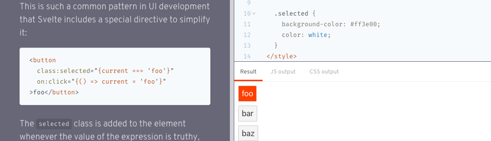
This is such a common pattern in UI development that Svelte includes a special directive to simplify it
<script>
  let current = false;
</script>
<style>
  .active {
    background-color: #ff3e00;
    color: white;
  }
</style>
<button class:active="{current}" on:click="{() => current = true}">
  Promote
</button>
To step through the above example, we have:
- a script var called
currentwith the value offalse - a button with an inline
on:clickhandler to set thecurrentscript value equal totrue - lastly, an inline class selector which says, if
current==true, then apply the css style ofactiveto this button.
All in all, this is a nice little directive and works well out of the box.
In the above example, we are inlining active, but you can of course inline any style you have available.
If, like me, you are using Tailwind, you might instead apply the Tailwind style directly like this:
<script>
  let current = false;
</script>
<style>
  // No need for an explicit component style. Instead apply the Tailwind styles directly as
  // border and primary are globally available.
</style>
<button class:border-primary="{current}" on:click="{() => current = true}">
  Promote
</button>
Again, this all works as expected. Running this locally in dev mode will give you the desired result.
But why NO in production?
On production build and deploy however, it may be that the Tailwind border-primary style may not apply?
And on further examination, opening your dev tools and inspecting the DOM element in production, you can interactively see that the Svelte directive is being applied correctly, but there is still no visual change taking affect?
This is what makes this such a tricky Gotcha! This directive works 99.99% of time, as long as the CSS definition applied is also applied elsewhere in your templates so is part of the global styles available. So what’s going on here?
Svelte under the hood (using Svelte 3.0 here) uses rollupjs to compile your applications js. If you check your default rollup.config.js contents, you should see in your plugins section something similar to
  plugins: [
    svelte({
      // enable run-time checks when not in production
      dev: !production,
      preprocess: sveltePreprocess({ postcss: true }),
Note that on build, rollup will preprocess your css styles to minify and remove unused styles as required.
The config for the postcss processing is found in the postcss.config.js file.
The key part in your Tailwind plugin section being that in production, the purgecss option is passed, eg:
module.exports = {
  plugins: [require("tailwindcss"), ...(production ? [purgecss] : [])],
};
The @fullhuman/postcss-purgecss package actually does a pretty good job of stripping un-needed styles and compiling your css to the smallest file possible.
But of course @fullhuman/postcss-purgecss is a stand alone package that isn’t part of the Svelte ecosystem.
It is not aware of this Svelte inline style directive, and therefore, doesn’t have rules based on ensuring inline styles used are not stripped in post processing.
The Fix
Ok, so we want to use this Svelte inline style directive, AND we also want to use an existing Tailwind style to work 100% of the time. How do we have our cake and eat it too? Well it’s actually pretty easy. We only need to create an explicit component style and use the Tailwind @apply directive instead. Example:
<script>
  let current = false;
</script>
<style>
  .active {
    @apply border-primary;
  }
</style>
<button class:active="{current}" on:click="{() => current = true}">
  Promote
</button>
In this way, the style will NEVER be stripped via the build process as its part of the Svelte component style block.
And we can still use @apply for all of our Tailwind styles without having to make custom css rules. Win.